

Ob-Gyn Office Website
Spectrum Womens Healthcare
Brief
An informational website for an obstetrics-gynecology practice relocating to a new office location and adding a new partner.
While there are a lot of pain points especially with billing and insurance our conversations revealed that addressing these global healthcare issues were beyond the practice's resources.
We focused on creating the authoritative source of information about the practice for pre-visit research ie SEO and helping the patient's prepare for their visits with:
- * Online booking through each doctor's preferred portal.
- * Maps with driving and parking information
- * Downloadable PDF patient forms.
Tools
- Squarespace
Role
Web Designer
Year
2017
Visual Design
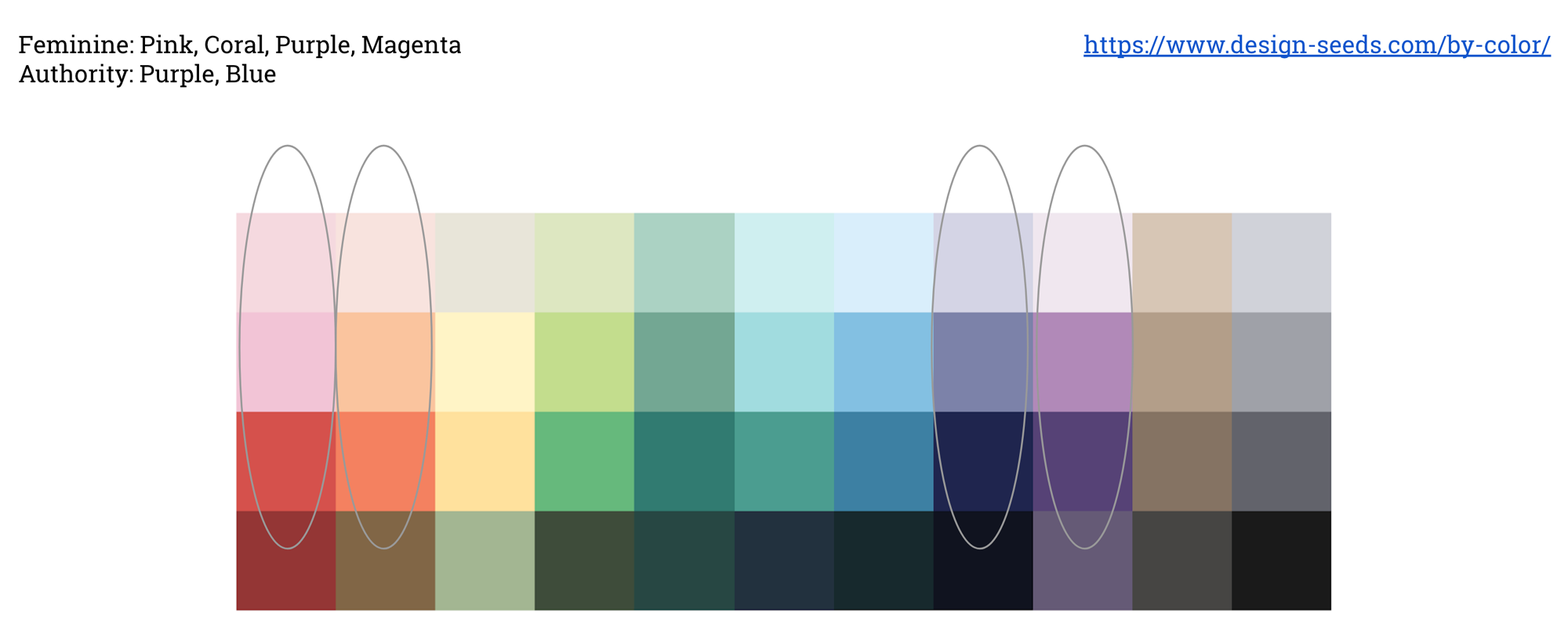
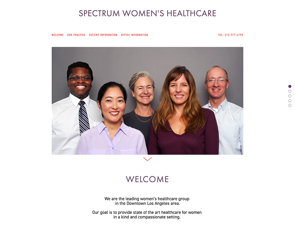
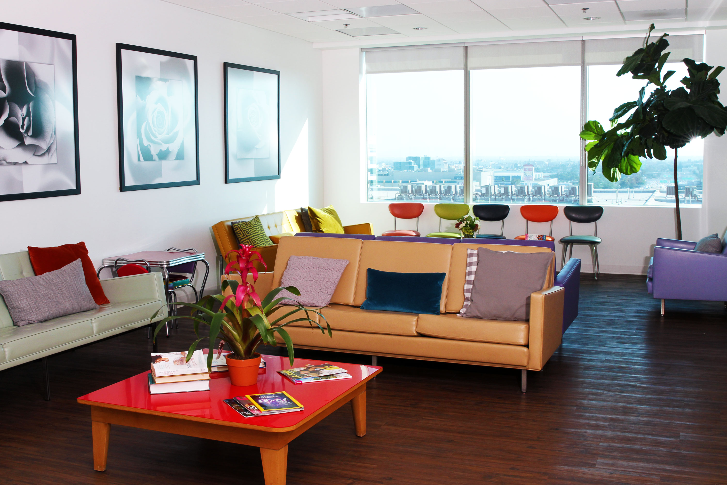
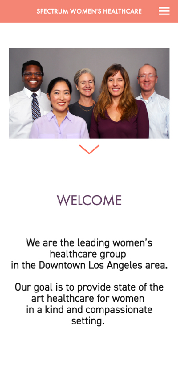
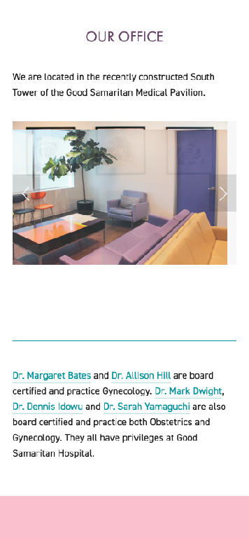
She wanted a site that reflected the partners' personalities and the new office which had colorful chairs, modern artwork and fresh flowers daily. As an Ob-Gyn practice it needed to be feminine without being girly.

We discussed the clientele in terms of Los Angeles neighborhoods and taste in fashion. While important for establishing a common visual language between us, it also became clear that the partners were not going to mirror their clientele's look.

Ultimately the subdued coral color of their new chairs informed the websites color palette. The website logo matched an Art Deco style font used on their business card.
Content Choices
The partners existing online presence was uneven. One partner had no presence at all . One other had very established practice in another part of town. The remainder feel in between those two extremes. We chose to add enough biographical information so that there was a good baseline for each physician.
Besides biographical content, we looked at 2 issues that come up a lot when visiting a doctor for the first time in Los Angeles: paperwork & parking.
Patient forms were made available for download on the site. It was decided not to integrate Electronic Medical Records at this point as they were evaluating their current provider. Online appointment scheduling was setup on an individual basis for each doctor.
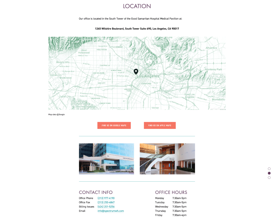
Parking is difficult in downtown and the location can be confused with an identically named street in Santa Monica. To fix that, we registered the office with both Google and Apple maps and provided clear map directions to the closest parking as well.
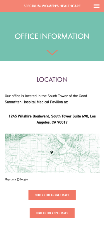
The layout is fully responsive with content resized and reordered to fit a single column for mobile users. The office location is registered with both Google and Apple maps so one click will open up directions in their respective apps on a visitor's phones.