
Crafting Web Presence
Research Driven Design for DTLA Gynecology's New Website
Brief
Dr Yamaguchi, a returning client, was leaving her previous practice after it was acquired by a large healthcare chain. When we spoke in August 2020, she was juggling seeing patients and finalizing leasing details for a new office, and business registration for her new practice. Her move-in target was the start of 2021. I was moving from Hong Kong to LA in early November.
The website requirements were straightforward, an informational website for a new solo obstetrics-gynecology practice. We wanted a focused site with just enough copy to do the job. The challenge was to get their with minimal stress.
Tools
- Squarespace 7.1
- Elation EMR
Role
Web Designer
Year
2020

Positioning
Dr Yamaguchi's practice was focused on providing convenient gynecological services to women working in and around downtown. It was clearly not at either extreme of ob-gyn services in LA which can range from natural childbirth to cosmetic gynecological procedures at the other.
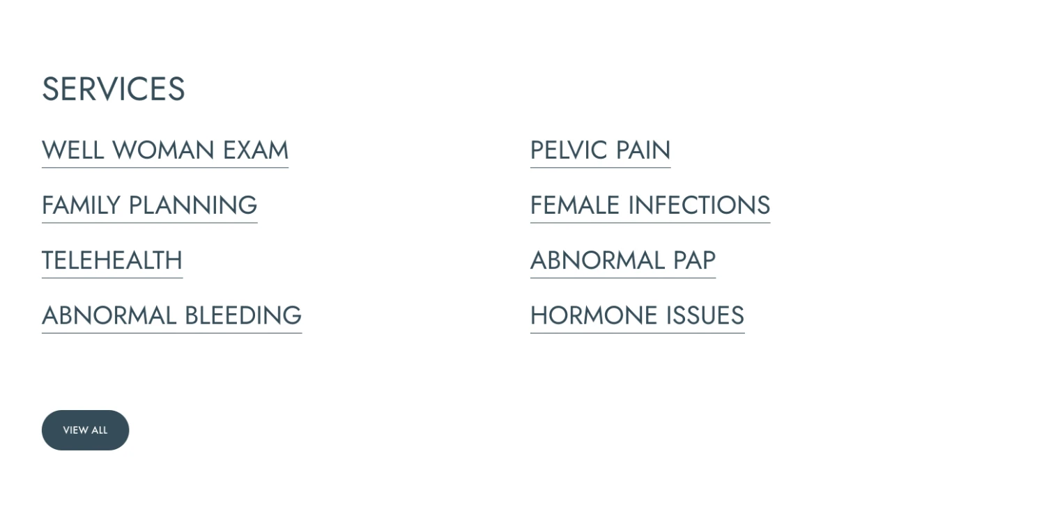
We iterated on a SEO-friendly list of services using plain English terms when possible. We kept the descriptions short as we're not trying to build a medical reference. There are plenty of reputable sites out there with good information. We did not have the time to write comprehensive articles about all her procedures and we felt outsourced content gave mediocre results.
The Look
Dr Yamaguchi's reviews talk about her fun but no nonsense bedside manner. How does that translate into the appearance of a medical professional's office or website?
A lab coat is basic, a spa experience luxurious. Branding from the inside out seemed out of place given her positioning and profession. Working from the outside in helped provide a context for a fairly arbitrary choice.
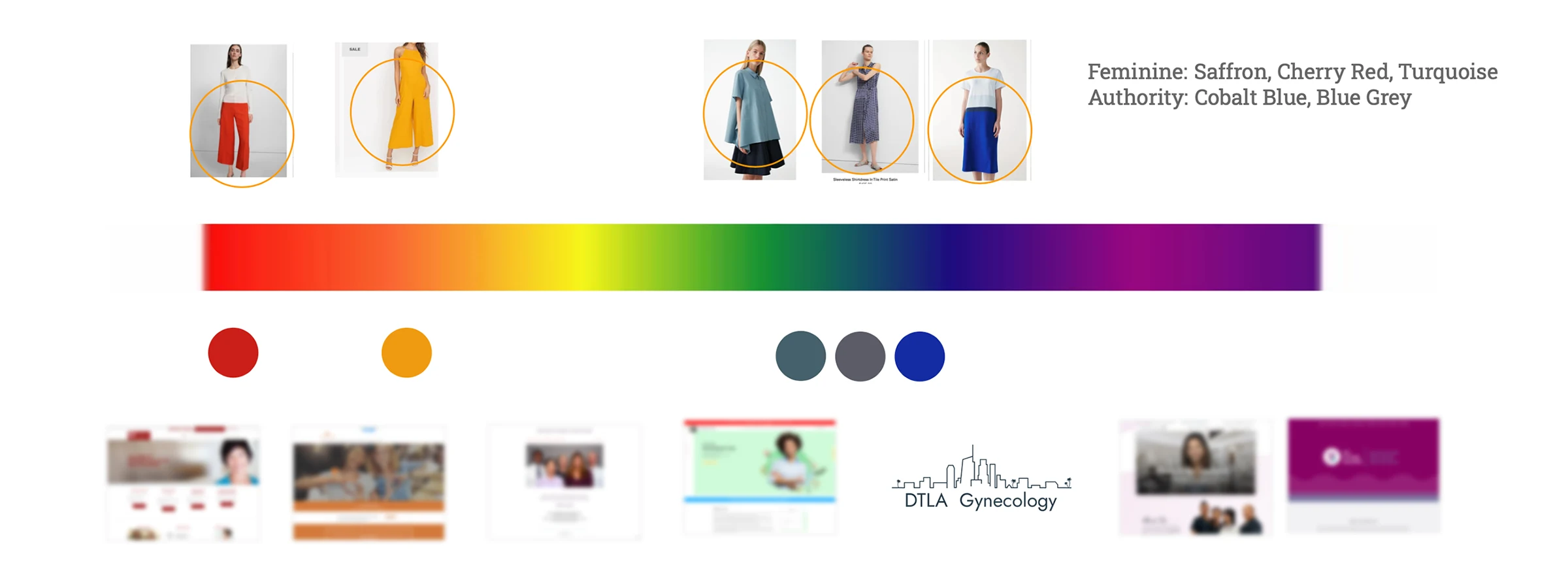
We seeded the color discussion using the websites of local women's clothing retailers as indicators of her clientele's taste. Then we looked at a color spectrum of competitor websites and found a gap in the blue part that differentiated her site from the others.
Her new office location was not finalized: any photos could not show choices about colors, furniture, or decor that were still in progress. On our previous collaboration we let the interior design of the office drive the website colors. This time, the web design had to accommodate a broad choice of office decor.
Squarespace 7.1
This was my first project using Squarespace's new 7.1 setup. A new interface allows global colors and fonts settings to cascade down while allowing local exceptions and quick iterations on variants. Other parts feel like a work in progress and with suboptimal support. I coded around shortcomings but a DIYer can run into trouble.
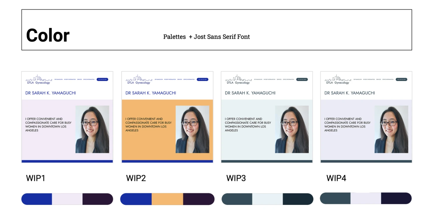
The new 7.1 templates favor a minimal Swiss modern style using san-serif type. Free Google fonts are included with Squarespace but ones using variable font technology have to be custom-coded. We chose Jost, a modern san-serif as our main typeface.
The website's colors are derived from 3 labeled as accent, light and dark in addition to black and white. Our choice of blue generated 8 color themes using a monochrome variants of blue. A style page with sample sections of these colors help us verify that all the themes satisfied WCAG contrast requirements.
Business needs drove website features
We encouraged most patients to self book online through Elation, her electronic medical records provider. The website was designed to allow self-booking with no intermediate steps between the website and the Elation booking page.
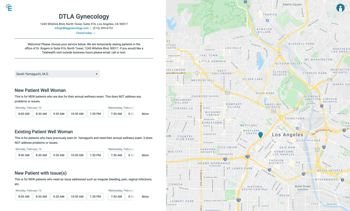
I went through the new patient signup process myself to identify issues that could be managed within the limitations of the platform.
Focus on client goals
Designers are great at visualizing possibilities. However mocking up and reviewing every potential avenue is time consuming. It's unproductive if everyone gets exhausted by decision overload. Why stress over the inconsequential?
I reduce the number of choices by mapping out goals early and limiting choices to ones that direct the client towards their goals.
I frame choices around business goals and the consequences of each choice.

